In 2022, a crypto exchange in Canada suffered a huge conversion loss.
Not because of fees.
Not because of competition.
Because people didn’t trust the brand’s interface.
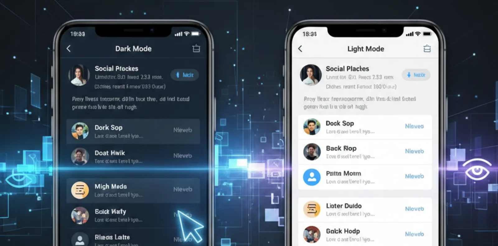
Dark, cluttered colors
Small, confusing text
No visible security reassurance
After a trust-centered redesign:
+52% increase in verified signups
–31% drop in support tickets
Investors viewed the brand as safer
Trust isn’t a claim.
Trust is a feeling — designed into every pixel.
Trust isn’t built later.
Trust decides whether users stay long enough to explore.
What Builds Trust Visually?
Transparency Cues
“This brand has nothing to hide.”
Clear pricing, visible guarantees
Consistency in UI
Predictability creates safety
Same patterns = user confidence
Security Signals
Certifications and encryption icons
Reduce fear at action points
Honest Language
No manipulative patterns
Respect builds loyalty
Human-Friendly Tone
Simple, supportive messaging
People trust people, not robots
Distrust Triggers to Remove Today
- Hidden charges
- Tiny terms
- Auto-added extras
- Sudden permission requests
- Spam-like CTAs
If UI looks suspicious → users treat you like a scam.
Trust = Better Business
- Brands that feel trustworthy experience:
- Stronger lead conversions
- Higher retention
- More referrals
- Lower support load
- Better reputation
Trust compounds like interest.
Case Study
Credibility as Fuel
Client
-
InvestIQ Wealth — Australia
(Online investment platform)
Challenge
- Users hesitated at onboarding + KYC upload
ODW Trust Strategy
- Simple, reassuring copy at critical steps
- Visible compliance badges
- Larger confirmation success states
- Predictive progress UI for guidance
8-Week Impact
| Metric | Result |
|---|---|
| Verified signups | +44% |
| Onboarding completion | +36% |
| Support queries | –28% |
| User confidence rating | Significant rise |
Once trust was visible, adoption followed naturally.
Final Thought
Trust isn’t asked for —
Trust is earned through design.
- sales@odw.rocks
- +91 9312342222