In 2020, Volkswagen rebranded globally.
Their logo went from:
3D shading → pure flat simplicity.
Why?
Because screens shrank:
smartwatches, mobile apps, EV dashboards.
Minimalism made the brand:
Lighter
Clearer
More digital
More future-ready
Within six months:
Website conversions up
Recall rates improved
Design costs reduced
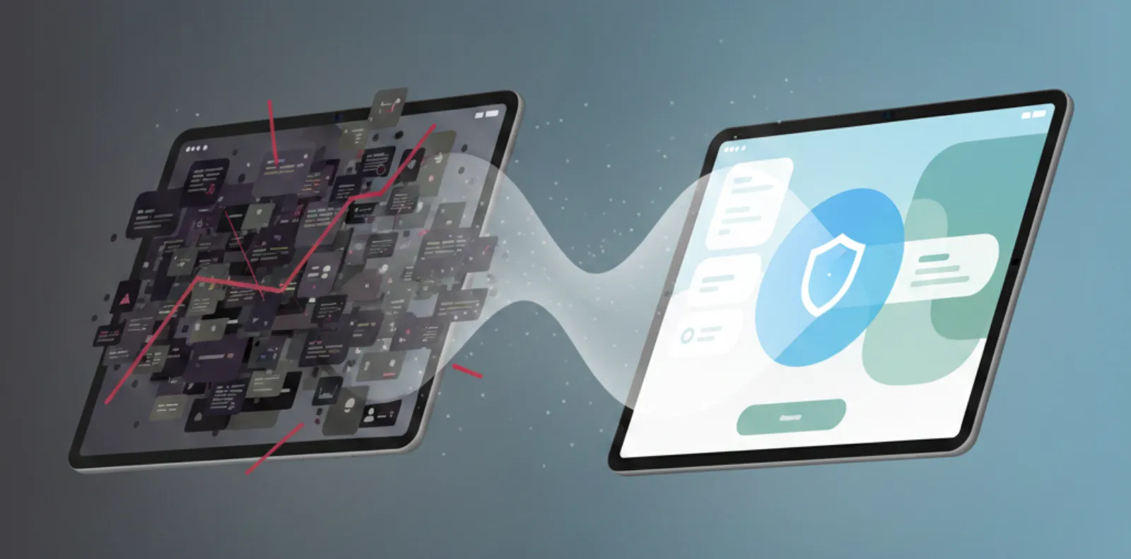
Minimalism isn’t lack of design.
It’s removal of everything that doesn’t matter.
Minimalism = Mental Comfort
- Clean spaces give:
- Calm
- Focus
- Confidence
Complexity creates fear.
Simplicity creates action.
Principles of Modern Minimalist Branding
Purposeful Reduction
Remove clutter → increase clarity
Only keep what drives conversion
Strong Visual Hierarchy
Guide attention like a story
The user should always know “where to look next”
Typography with Personality
Minimal doesn’t mean boring
Letters become the emotion
Bold Composition
Use space as a design asset
Emptiness creates meaning
Consistency as Identity
Recognition through repetition
Same voice, same feeling, everywhere
Minimalism Isn’t “Less Design”
- Bad minimalism is:
- Empty
- Lifeless
- Low context
- Good minimalism is:
- Intentional
- Confident
- High impact
Minimalism = ROI.
Minimal = More Performance
- Faster load speed
- Stronger responsiveness
- Clearer CTAs
- Better emotional impact
- Higher accessibility
Minimalism = ROI.
Case Study
Simple = Powerful
Client
-
MegaMart Hyper Retail — Oman
(E-commerce for fast-moving consumer goods)
Challenge
- Crowded visual identity → confused shoppers
ODW Minimalist Redesign
- Flat color system
- Fewer fonts, stronger variations
- Simplified category structure
- Space-driven attention guidance
7-Week Outcome
| KPI | Result |
|---|---|
| Add-to-cart rate | +29% |
| User browsing duration | +22% |
| Design maintenance cost | –45% |
| Customer satisfaction score | Higher clarity noted |
Less visuals. More value.
Final Thought
Minimalism isn’t about removing design.
It’s about removing obstacles.
- sales@odw.rocks
- +91 9312342222