On June 21, 2023, when the UK government unveiled a redesigned online visa portal, something unexpected happened:
Users stopped submitting forms midway.
Not because of eligibility…
Not because of documentation…
But because the process was confusing.
Complaints poured in.
Applicants panicked.
Trust fell sharply.
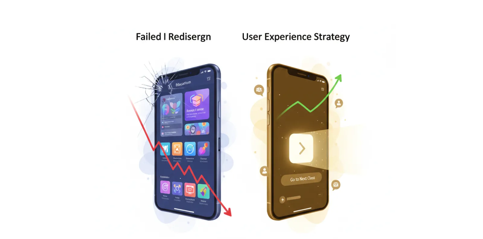
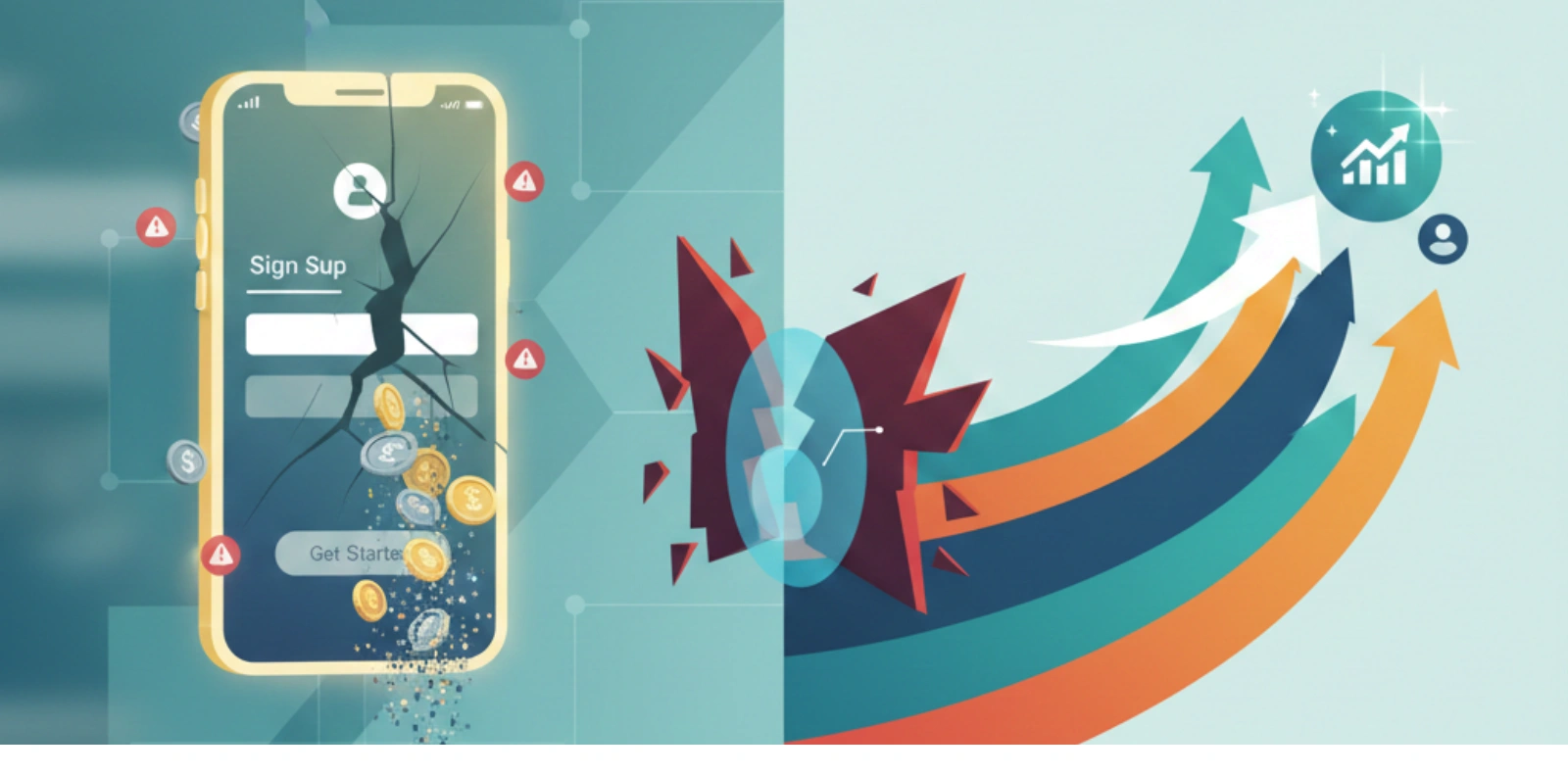
A complex system without intuitive UX becomes a barrier, not a service.
People don’t fail to use products.
Products fail to understand people.
And in 2025 — users won’t tolerate failure.
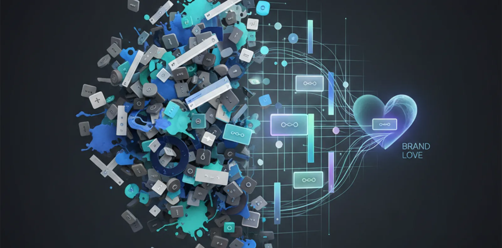
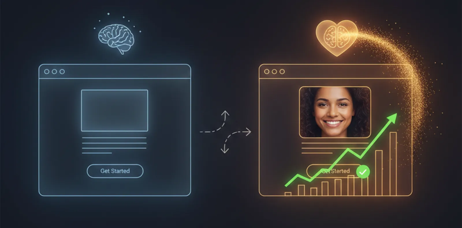
UX = Understanding Humans, Not Designing Screens
UX isn’t “pretty layouts.
UX is behavioral psychology applied to digital systems.
Great UX answers three fundamental human needs:
| Human Need | UX Response |
|---|---|
| Ease | Remove friction |
| Clarity | Remove confusion |
| Emotion | Add delight |
If any of these fail…
conversion fails with them.
UX Problems Are Business Problems
Examples of invisible revenue killers:
| UX Issue | Business Loss |
|---|---|
| Slow page load | Customers leave instantly |
| Confusing navigation | People get lost → no goal completion |
| Poor readability | Brain fatigue → exit |
| Too many fields | Drop-offs increase |
| No guidance | Anxiety → abandonment |
UX mistakes may be tiny —
but they cost millions.
Why UX Changed From “Nice-to-Have” → “Need-to-Win”
Because people have options.
If one product frustrates them?
They swipe to the next.
The modern user expects:
Mobile-first experiences
Zero learning curve
Clear storytelling
Fast response
Empathy in every touchpoint
UX is no longer a feature.
It’s your competitive advantage.
5 UX Principles That Create Instant Impact
Don’t Make Me Think
Every click should feel obvious.
If users must think too hard — they drop off.
Example:
One CTA per screen → Focus drives action.
Reduce Choices, Increase Confidence
More options = more anxiety.
Decision simplicity wins conversion.
Example:
3 pricing plans outperform 5 → less confusion.
Speak Human
Remove jargon. Add clarity.
Clear language builds trust instantly.
Example:
“Need help picking?” → Support + calmness.
Design for Thumbs, Not Mice
60–80% of usage is mobile-first.
UX must fit into a single thumb zone.
Example:
CTA buttons easy to reach → higher tap action.
Emotional Feedback
Micro-animations & responses that reward action.
Delight drives habit.
Example:
Animated success tick → “I did it right!”
The UX Hierarchy of Needs
- A product must pass through these levels:
- It works
- It’s usable
- It’s intuitive
- It’s enjoyable
- It creates loyalty
Most companies focus on Level 1 & 2…
The winners focus on 4 & 5.
Quick Audit: Is Your Product UX-Human Enough?
Answer these honestly:
| Question | If “No” → Alert |
|---|---|
| Can a new user complete a task in 2 steps or less? | Friction |
| Do users smile at least once during the journey? | No emotion |
| Can someone elderly use it without guidance? | Accessibility gap |
| Does the interface “explain itself”? | Poor intuitiveness |
If at least one answer is “No” → improvement needed.
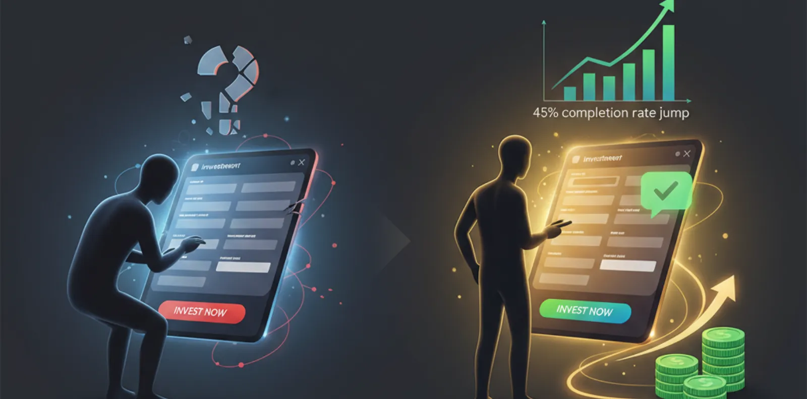
Case Study
UX Turned Confusion into Conversions
Client
-
CrediLink Solutions — Canada
(Loan eligibility assessment platform)
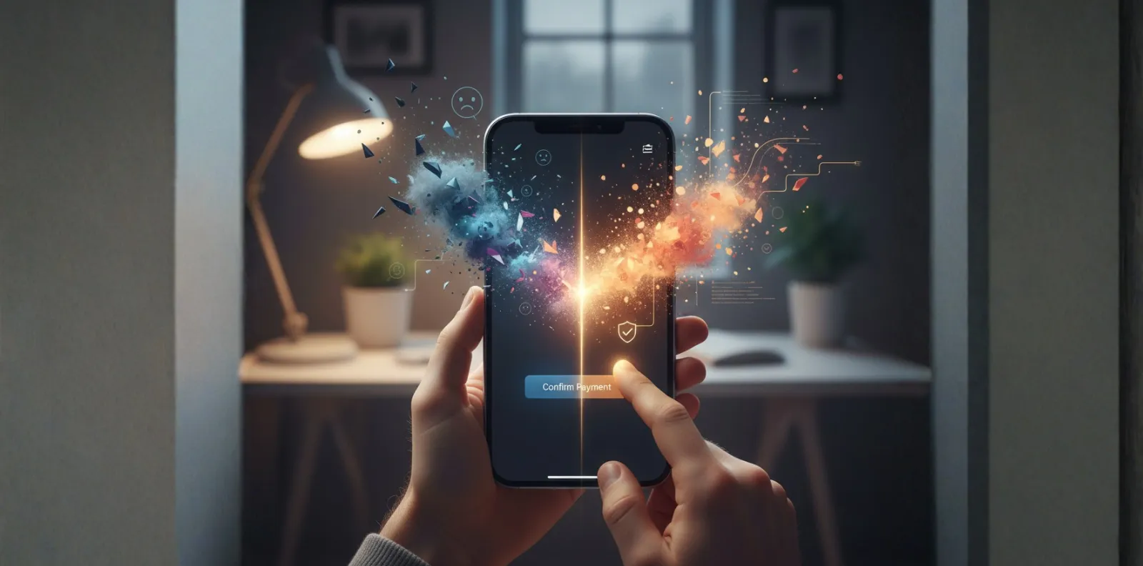
Challenge
- Users unsure if they qualified
- Drop-offs at form stage very high
- Low trust in the sign-up process
ODW Intervention
- Human-centered redesign of the entire journey
- Friendly explanation of each question
- Progress indicators that reduce anxiety
- Visual reassurance → “You’re almost approved!”
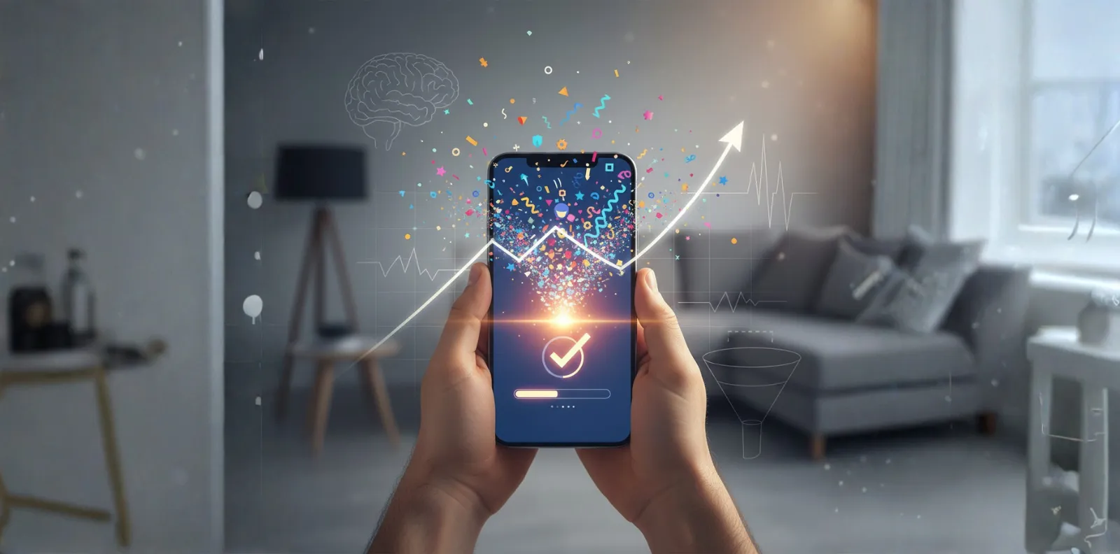
Measured Gains in 45 Days
| Metric | Impact |
|---|---|
| Form completion rate | +73% uplift |
| Time to apply | –41% faster |
| Help request volume | –28% reduction |
| Positive feedback sentiment | Surged across channels |
Users didn’t become smarter.
The product became more human.
In 2025 and Beyond:
Success = Delight x Efficiency x Trust
The future belongs to products that:
Feel invisible
Think ahead
Comfort the user
Solve with empathy
Don’t design for the screen.
Design for the human behind the screen.
- sales@odw.rocks
- +91 9312342222