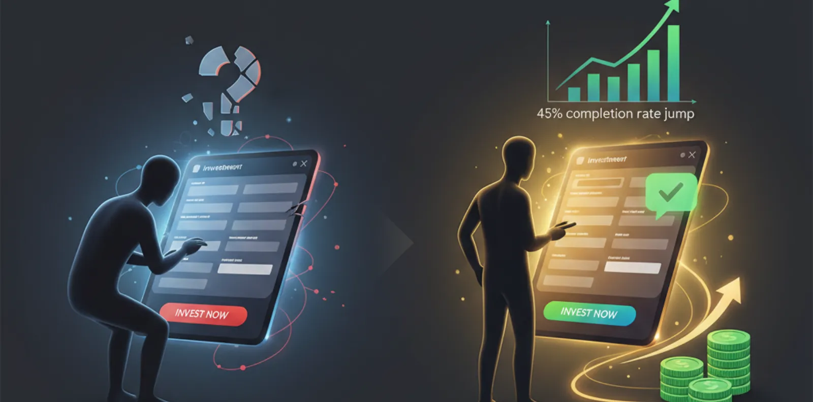
In 2021, a fintech startup launched a brilliant product — but almost no one completed the signup.
Investors panicked.
Marketing blamed product.
Product blamed marketing.
Developers blamed unclear requirements.
Turns out…
The “Get Started” button was below the fold on mobile.
One small UX mistake → thousands of customers lost.
They didn’t have a product problem.
They had a friction problem.
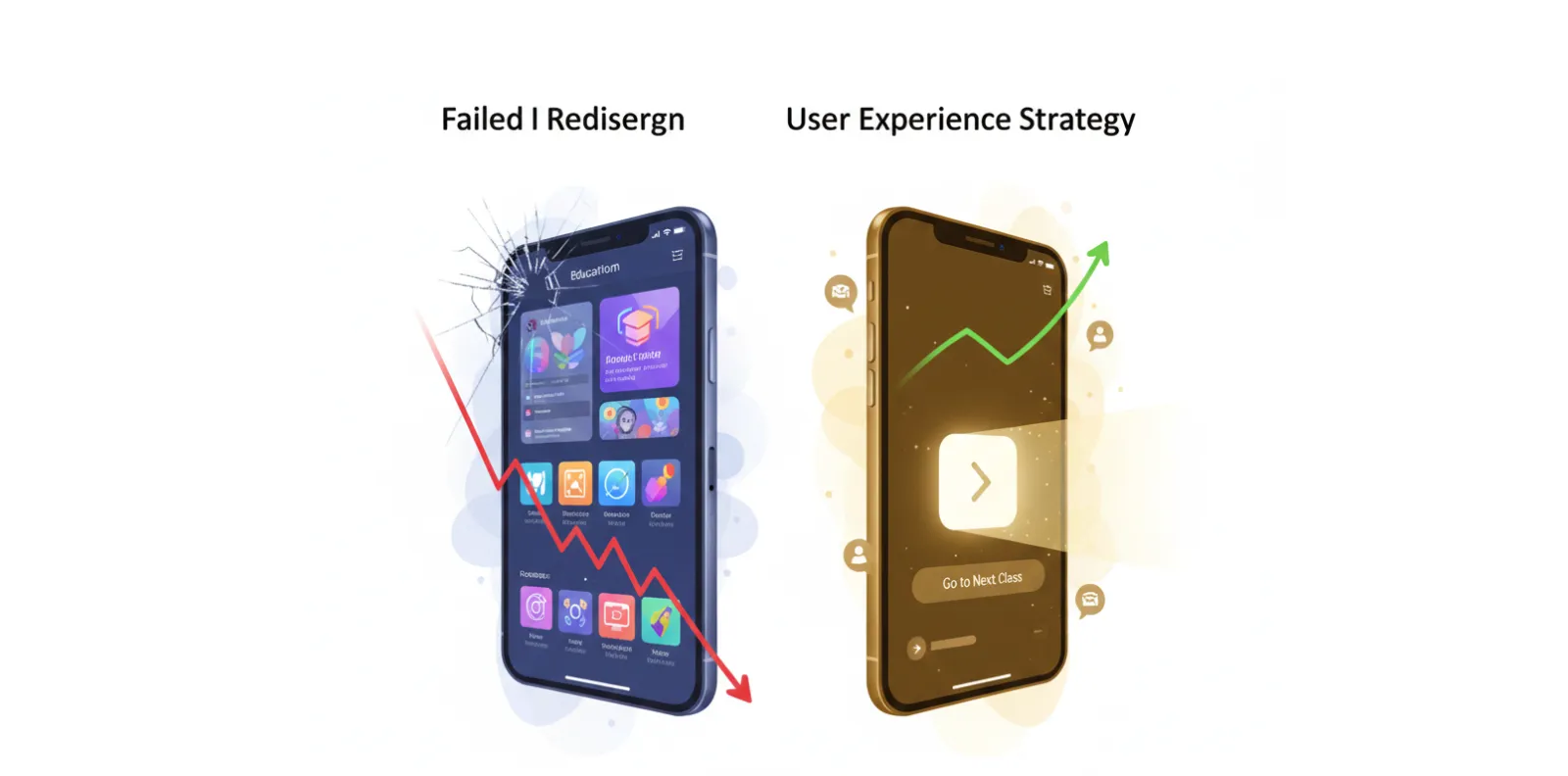
Startups fail not because their idea is bad —
but because users can’t reach the value fast enough.
Let’s fix that.
UX Mistakes That Kill Growth
Here are the most expensive — but easily solvable — UX errors:
Too Many Steps Before Value
Asking for everything before giving anything.
Users must experience value before committing to value.
Fix: Free preview flows, guest onboarding, social login
Confusing Navigation
If users get lost → they leave.
Clarity is conversion.
Fix: One core task per screen, fewer menu items
Slow Load Speeds
Every extra second = –7% conversion
Speed isn’t a nice-to-have. It’s revenue.
Fix: Image optimization, caching, lightweight components
Sign-Up Walls Everywhere
Don’t block curiosity.
The best UX says “welcome,” not “prove yourself.”
Fix: Show product benefits before sign-up prompt
No Emotional Feedback
If users don’t know they succeeded → they stop.
Celebration creates momentum.
Fix: Success animations, microcopy, delightful interactions
Desktop-First Designs
80% users are mobile-first.
If thumbs struggle, minds quit.
Fix: Thumb-friendly layouts and hero CTA placement
No Assistive Clarity
Financial, medical, and form-heavy apps fail without transparency.
Users don’t like mysteries in serious flows.
Fix: Tooltips, guidance copy, error prevention messages
UX Fixes That Deliver Instant ROI
- Do these before your next product update:
- Put CTA above the fold
- Reduce form fields by 50%
- Add social login & autofill
- Use progress bars
- Run a micro-survey after failure points
- Remove any feature that confuses users
- Deliver a tiny dopamine win on first interaction
Every one of these → measurable conversion lift
Real Cost of Bad UX
Startups lose:
55% trial users before day 2
70% drop-off during first form
89% leave after a bad mobile experience
Trust after one confusing moment
Why?
Because users blame you, not your UX.
The UX Acceleration Loop
Ship → Measure → Learn → Improve → Repeat
This rhythm turns startups into winners.
Perfection is slow.
Progress is profitable.
Case Study
AI Turned a Startup Into a Growth Machine
Client
-
PayGate Africa — Kenya
(Fast-growing digital payment platform)
Challenge
- Users getting stuck during payments
- Drop-off high on mobile
- Support calls flooding daily
ODW UX Fix Strategy
- Redesigned mobile-first flows
- Added biometric quick-pay
- Simplified forms from 14 fields → 5
- Introduced interactive “Payment Successful” animation
10-Week Results
| Metric | Result |
|---|---|
| Successful transactions | +58% increase |
| Support tickets | –33% lower |
| Customer reviews | +4.6 avg rating |
| Returning users | +41% uplift |
They didn’t change the product.
They changed the path to the product.
Final Thought
Users don’t remember features.
They remember how the product made them feel..
Delight wins.
Confusion kills.d
Let’s remove friction, simplify success, and let your product grow without resistance.
- sales@odw.rocks
- +91 9312342222